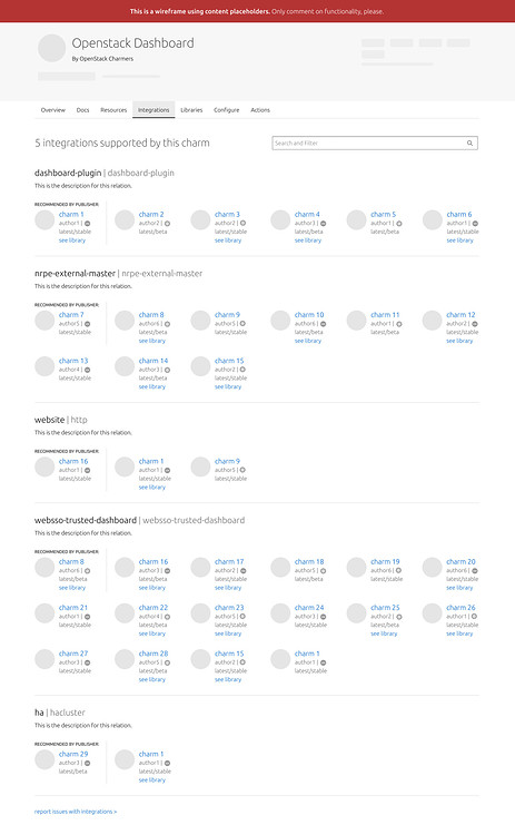
We have been working on the “Integrations” tab within the charm’s detail page. This tab will list the integrations supported by a charm, allowing users to discover how they can connect to that specific charm.
We’d love to get feedback from the community on this new UI tab - just drop us a reply below, we’re always interested in hearing from you. (just a note to mention that some of the features presented here are part of a long term vision and will need more cross teamwork.)
As you can see on the wireframe, it will be displayed at the top how many integrations there are for that charm. For each integration there will be an optional description added by the publisher and a list of available charms - the API will search what charms fit into that relation and it will list them. Since the list of charms can be extensive, the publisher can pick which charm recommends for each of the integrations. Then, for each charm, we display the icon, the charm’s name with a link to that charm’s details page, the author, the platform, the risk level and, if applicable, a link to the library that supports the relation.
[alt: wireframe of the Integration tab]
Search and filter functionality
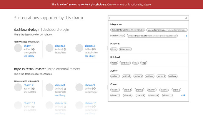
To help users narrow down the list of integrations, we will have the search and filter pattern. This design system pattern is actively used across Canonical products.
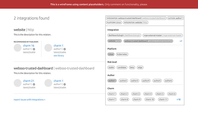
This pattern provides the ability to search and filter in one bar. When clicking on the search bar, it opens a panel listing groups of available options (Integration, Platform, Risk level, Author and Charm). Users can type and pick the filter items from the panel, or submit direct keywords to query the data.
[alt: crop of the page focusing at the search and filter bar - on click displaying the panel with filters]
[alt: crop of the page focusing at the search and filter - chips selected and page displaying the results]
Looking forward to hearing your thoughts/feedback.
Cheers,
Ana & the Canonical Design Team


